Crafting the
Perfect Mobile Experience with Wix Mobile Editor
Empowering 200 Million Users to Create Stunning Mobile Sites
The Wix Mobile Editor was designed to solve a growing challenge: how to create a mobile-friendly version of websites while maintaining full control over what appears on desktop vs mobile. As mobile usage surged, it became essential for users to customize their mobile sites independently from their desktop versions.
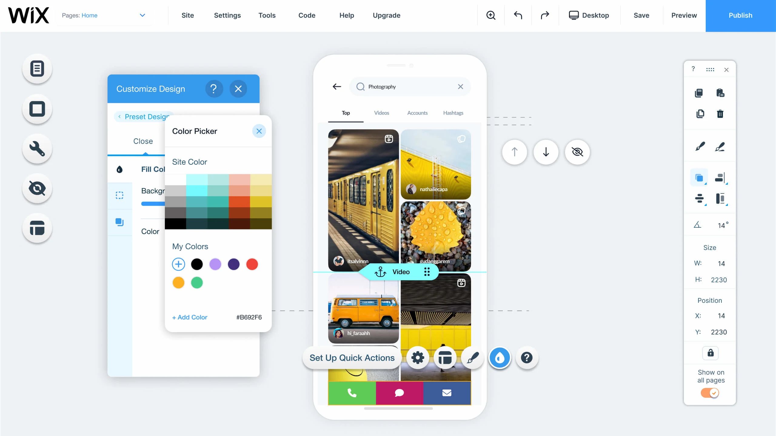
The mobile editor lets users drag and drop elements, customize templates, menus, colors, and shapes in a ‘what you see is what you get’ environment. It provides flexibility and ease, allowing users to build a beautiful mobile experience with precision.
Empowering
users to create
mobile websites
The goal of the Wix Mobile Editor was to empower users to design and fully control their mobile websites with the same ease and flexibility they had on desktop. As mobile usage increased, it became essential for users to ensure their mobile sites aligned with their brand while catering to mobile-specific needs.
The product allowed users to customize layouts, add elements, and manage mobile features with ease. By providing these intuitive tools, users could improve both the look and functionality of their mobile sites, making the design process more efficient and tailored to their needs.
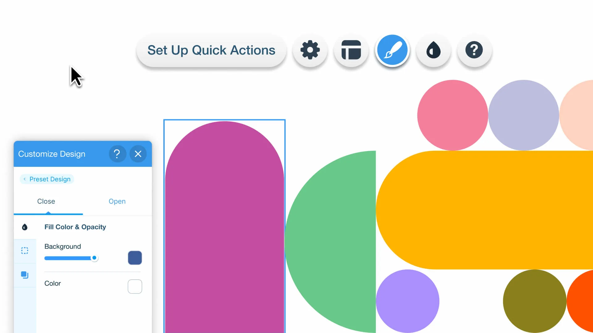
Set Up
Quick Actions
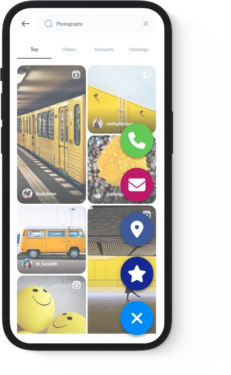
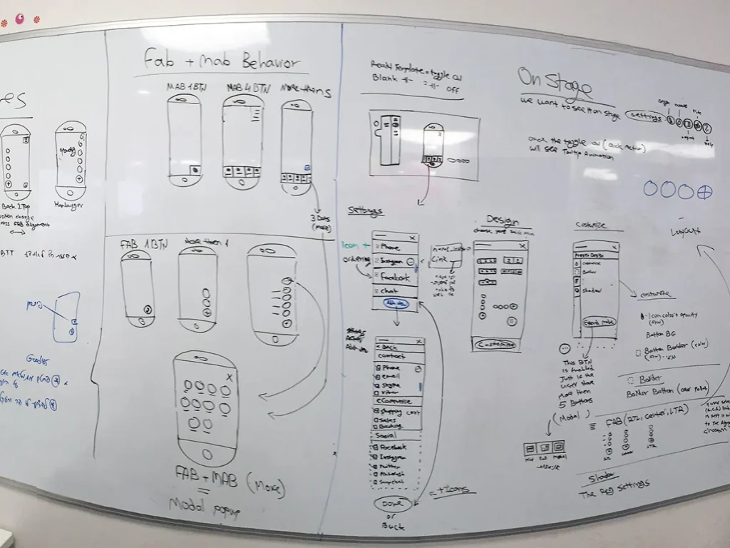
Add a Quick Action Bar (QAB) to your mobile site to make it easy for visitors to reach you. You can include actions like Instagram, WhatsApp, email, or custom links, giving them fast access to the info they need or a direct way to contact you.
At Wix, we design based on data, always driven by user insights, never gut feelings
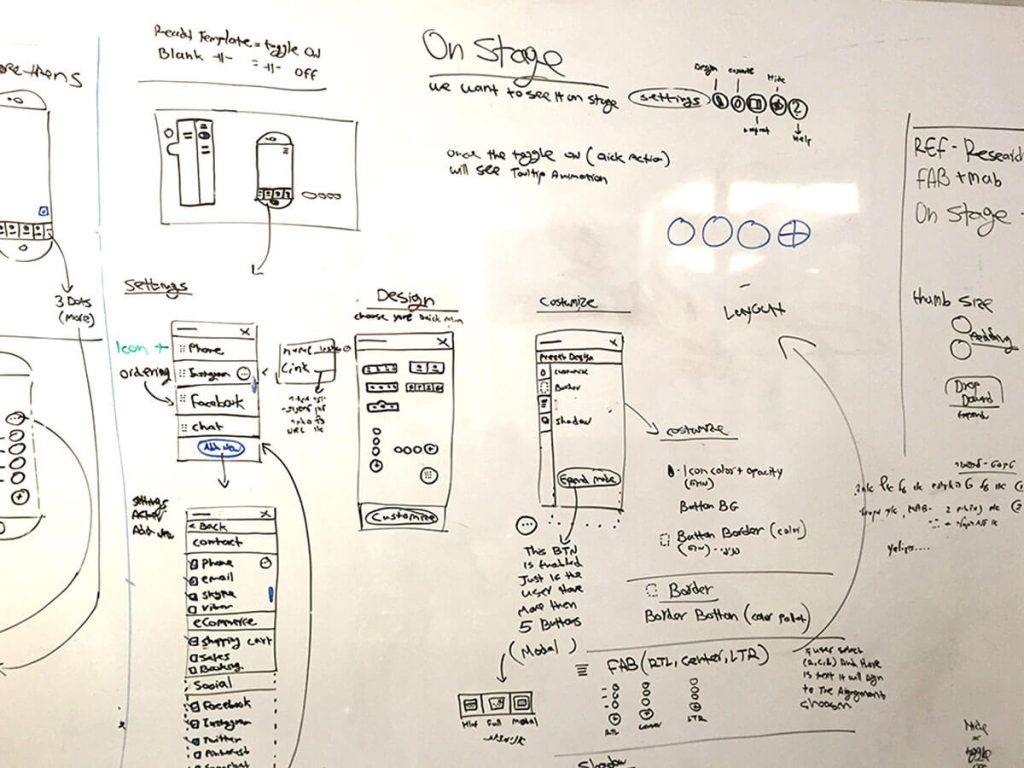
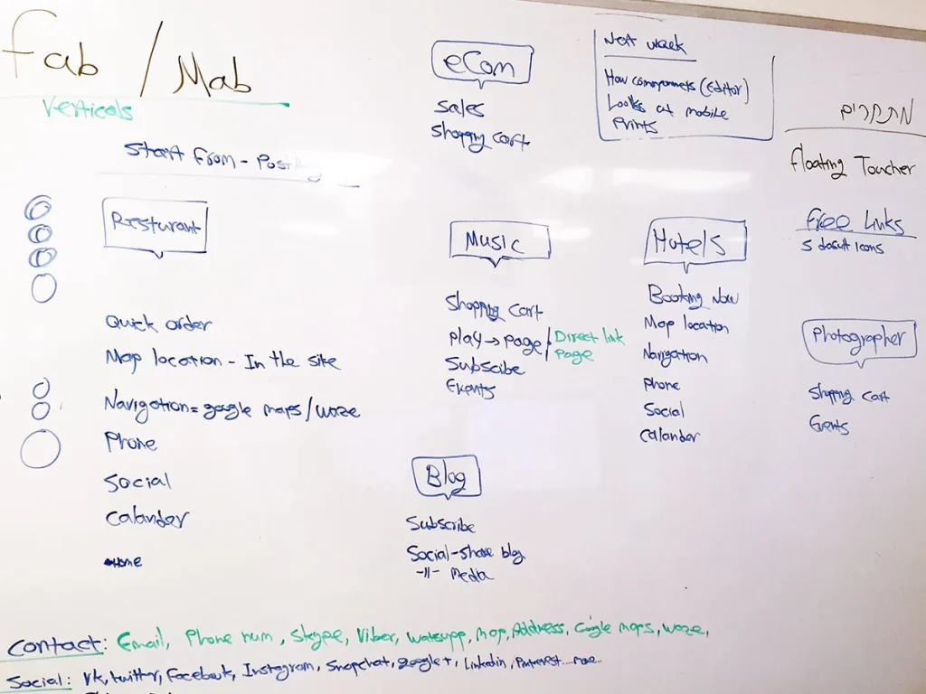
To deeply understand users’ needs, the product manager and I traveled to San Francisco and New York to conduct usability tests and interviews with Wix users. Prior to these meetings, I gathered background information on each user, including their websites, businesses, and support tickets they had submitted, ensuring more meaningful and informed discussions.
We also reviewed support calls and closely examined the challenges users faced, particularly around the mobile action bar. These insights allowed us to address real user pain points and make data-driven decisions throughout the development process, ensuring the product met user expectations.
Data-Driven Insights
Usability Testing
We conducted hands-on usability tests with Wix users to observe how they interacted with the mobile editor. These sessions provided real-time insights into user behaviors, frustrations, and workflows, helping us identify areas for improvement in the design and functionality of the mobile editor.
Listening to Support Calls
We reviewed support calls to gather insights into common user issues. Hearing directly from users and support agents helped us uncover recurring problems, particularly with the mobile action bar. These findings helped ground our design decisions in real user pain points and ensured our fixes addressed the highest-impact usability issues.
User Interviews
In-depth user interviews were held to dive deeper into individual experiences. We discussed their specific needs, pain points, and expectations for the mobile editor. This qualitative feedback shaped our design decisions and ensured the product addressed real user challenges.
BI and Support Insights
We worked with the BI team to analyze user data, giving us a clear view of feature usage. Additionally, we reviewed support tickets to spot trends and recurring concerns. This data helped us measure design effectiveness and improve user satisfaction
Design system
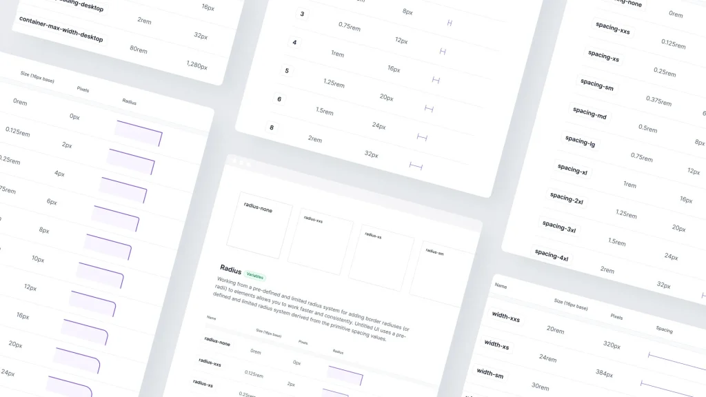
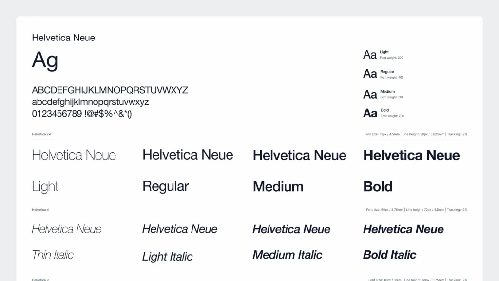
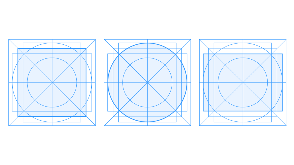
At Wix, the design system maintained consistency by using predefined components and styles, ensuring alignment with the brand. This streamlined the design process, allowing us to focus on enhancing the user experience.
The system also improved collaboration between teams, as designers and developers worked with the same visual language. This sped up development and ensured a cohesive, user-friendly product across all platforms.
Spacing, radius & grids
Typography
Floating Action Button
Mobile Action Bar
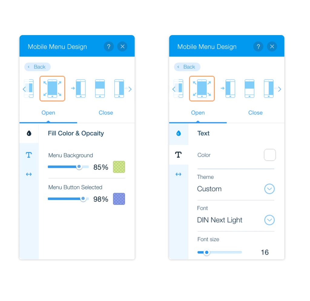
Mobile Editor Panels
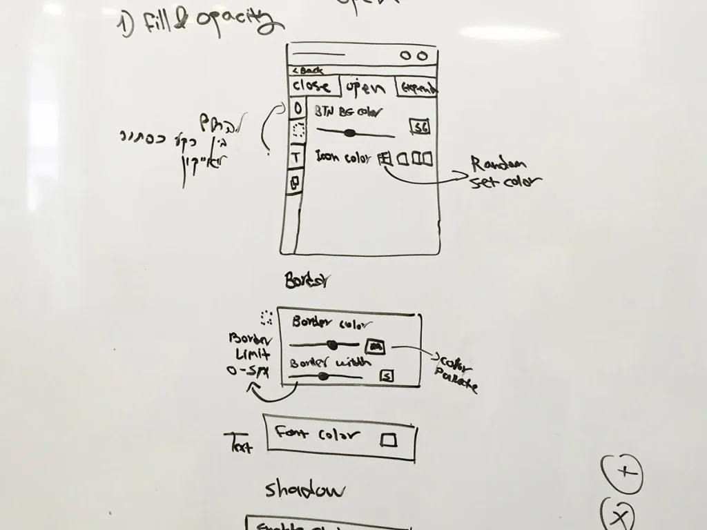
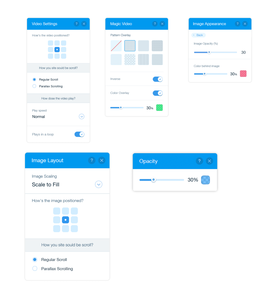
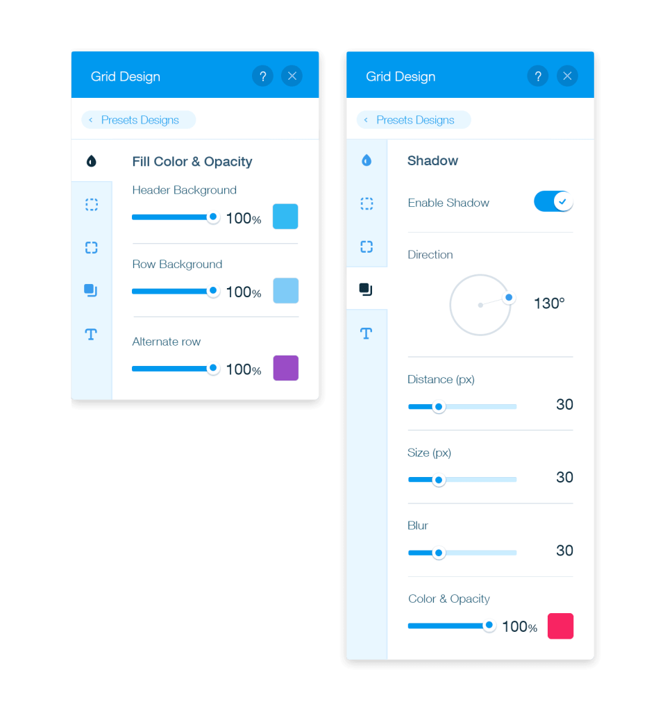
The goal is to give users complete control to customize anything and build exactly what they imagine. These panels offer a range of design tools, helping users create the best possible interface for their needs.
Designing for Mobile Excellence
Discover how user-focused UX design redefines website creation, providing intuitive tools that simplify building and inspire creativity anytime, anywhere.